The Fun Stuff: Artistic Influence & The Human Touch
Exploring how illustration, experimental color, and bold graphics turn a corporate identity into a community-led world.

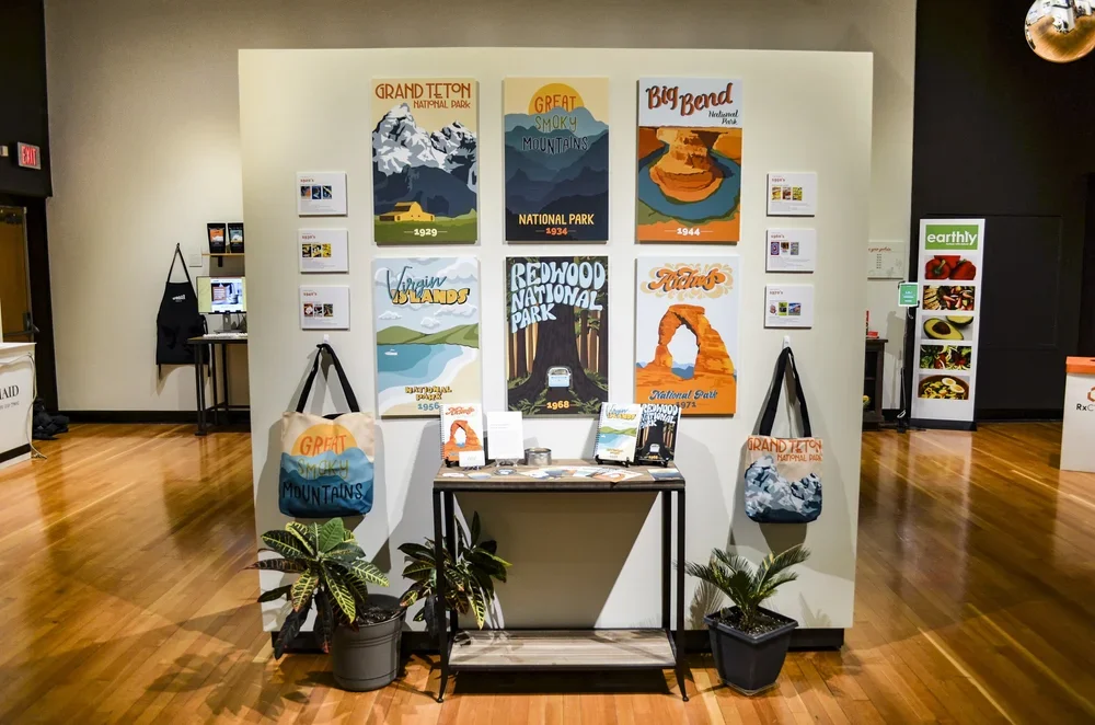
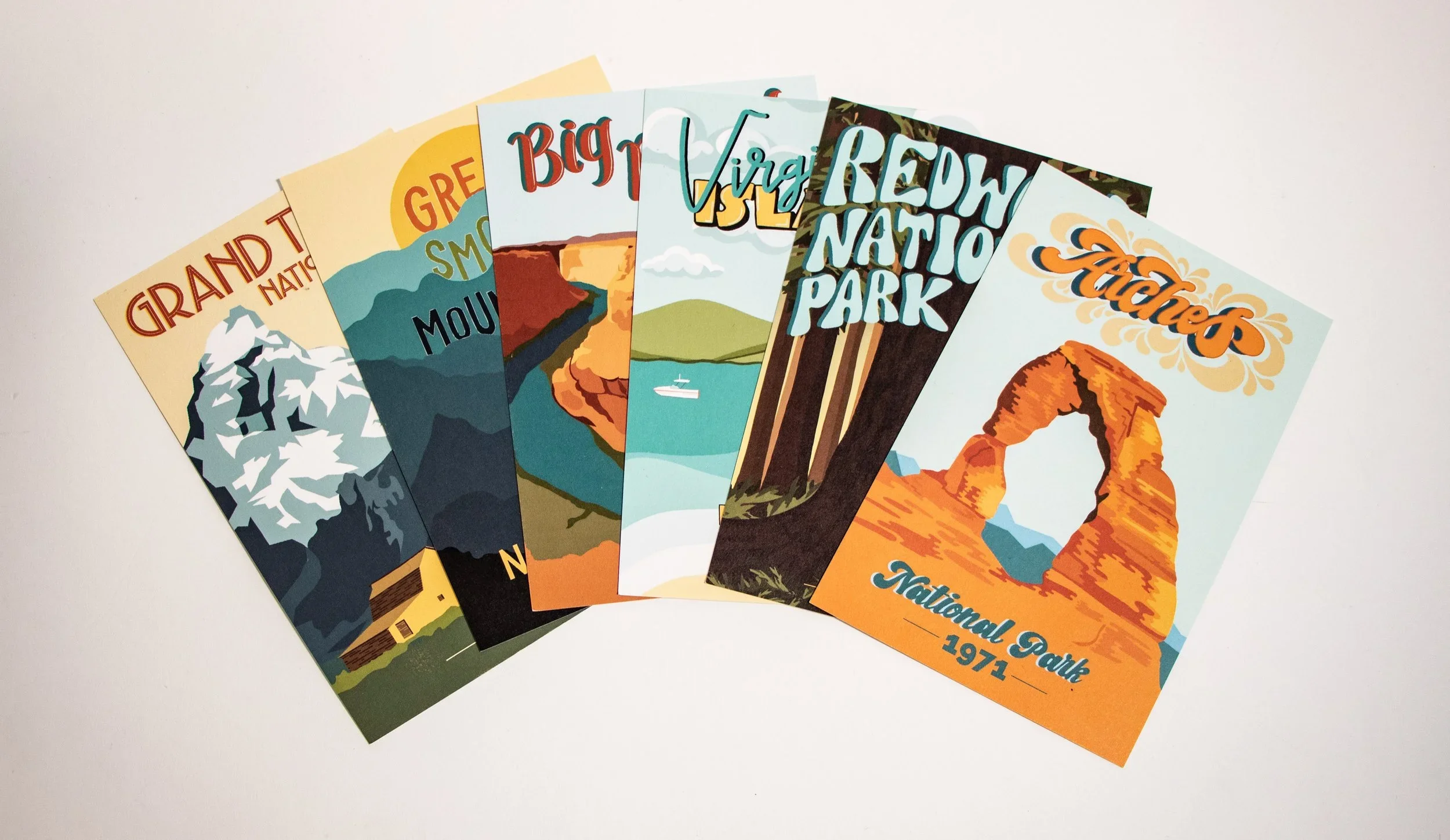
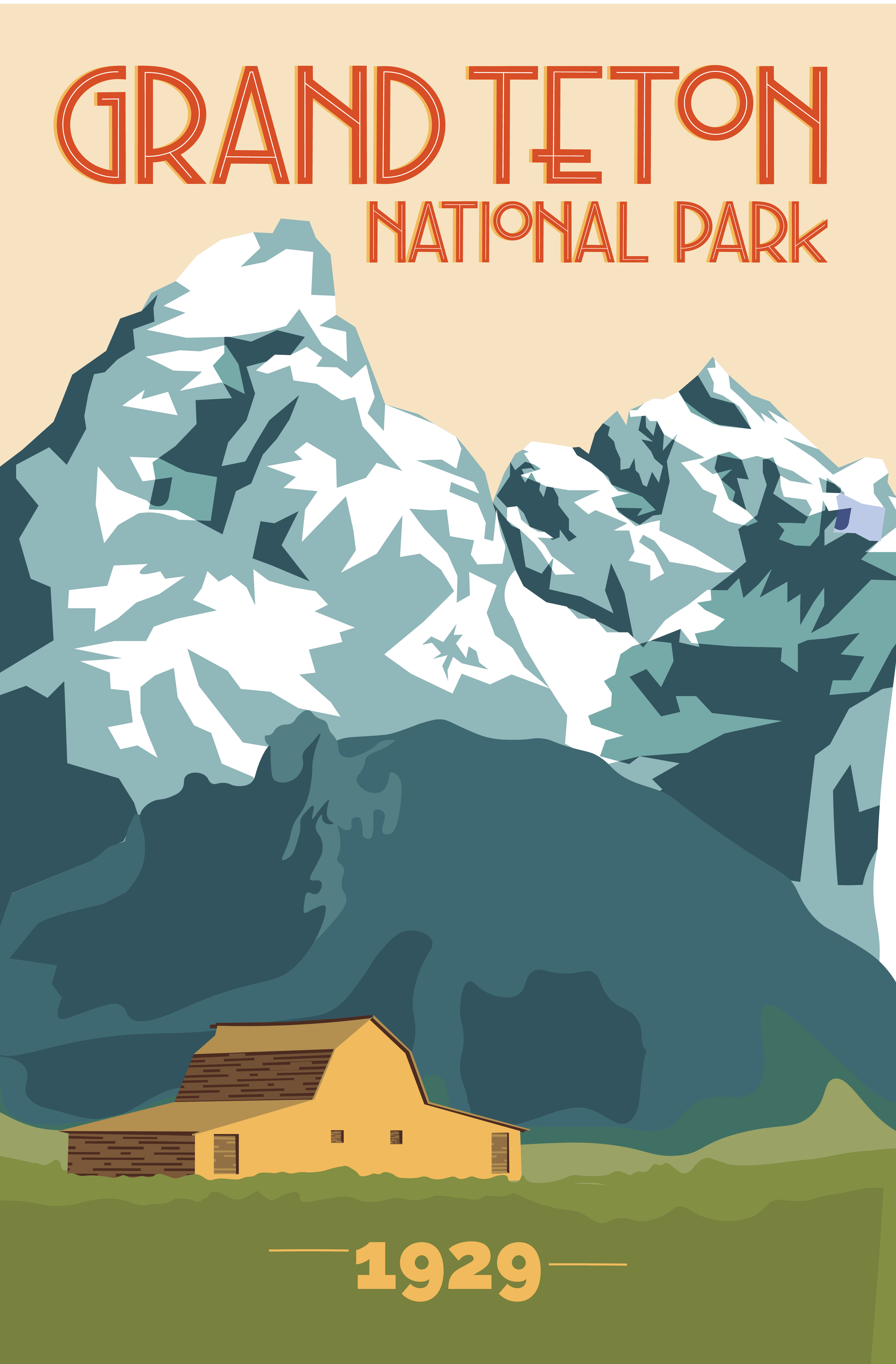
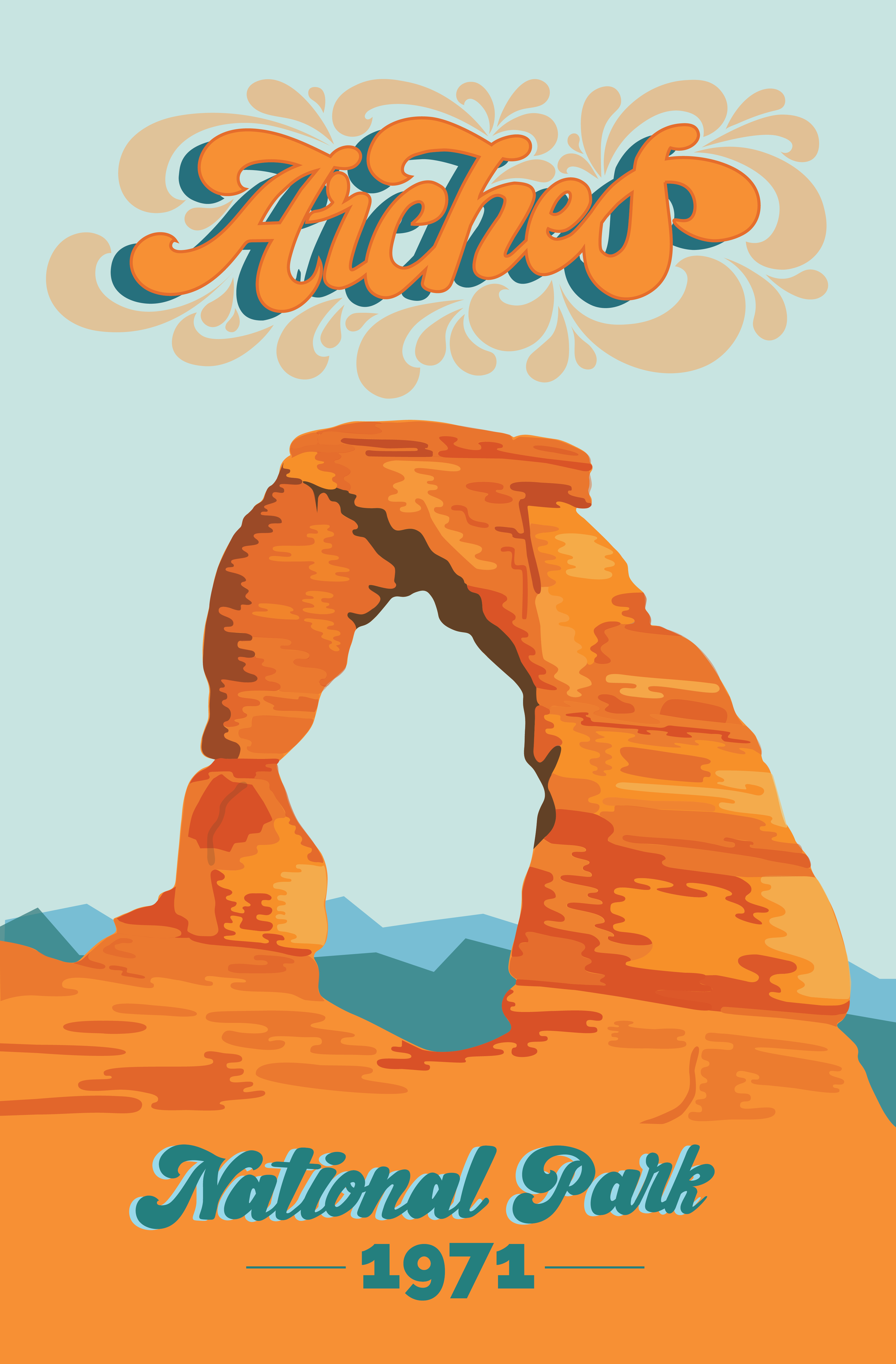
A Typographic Journey Through the Parks
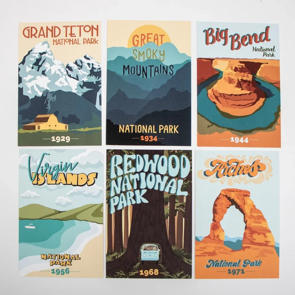
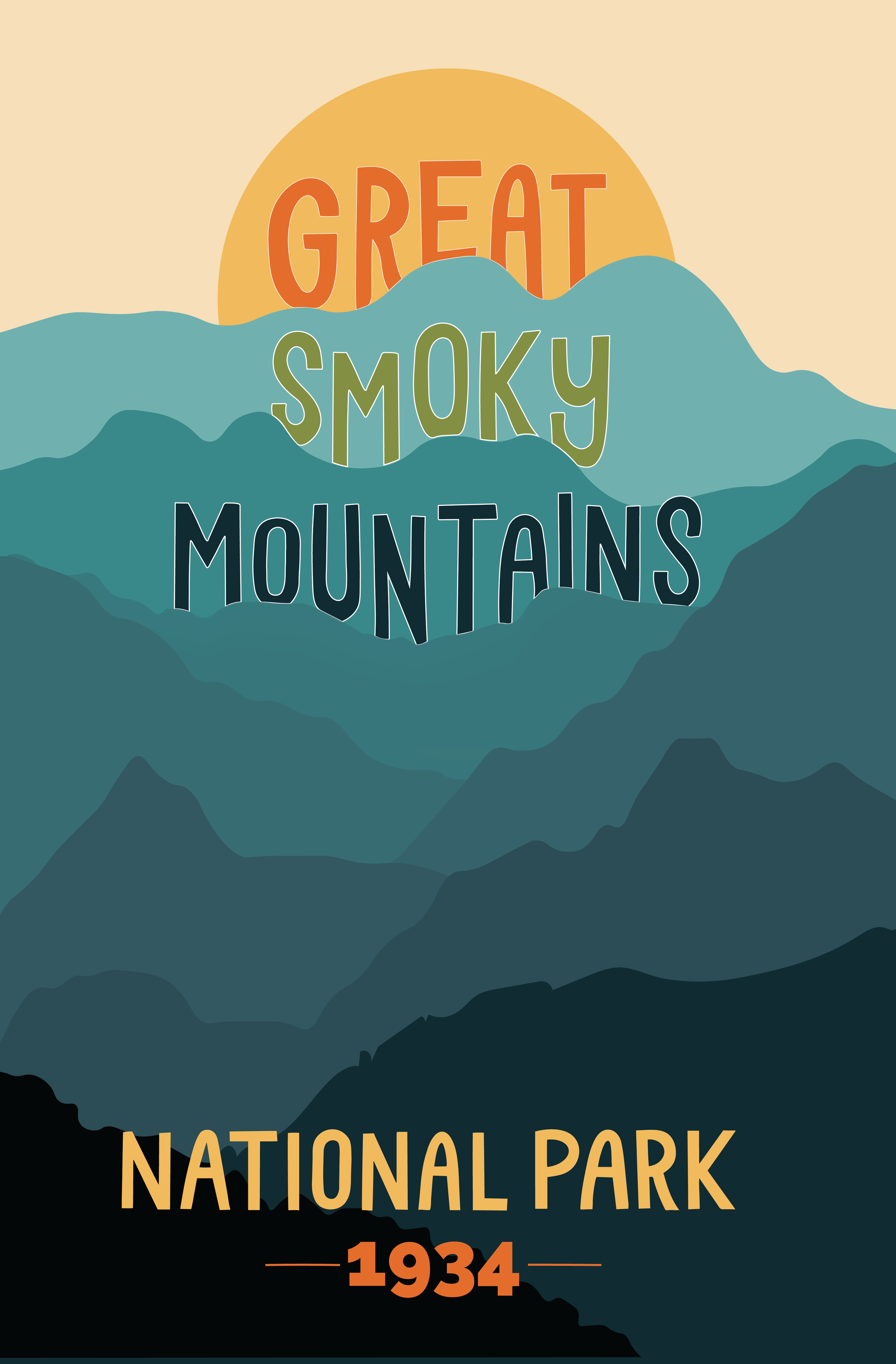
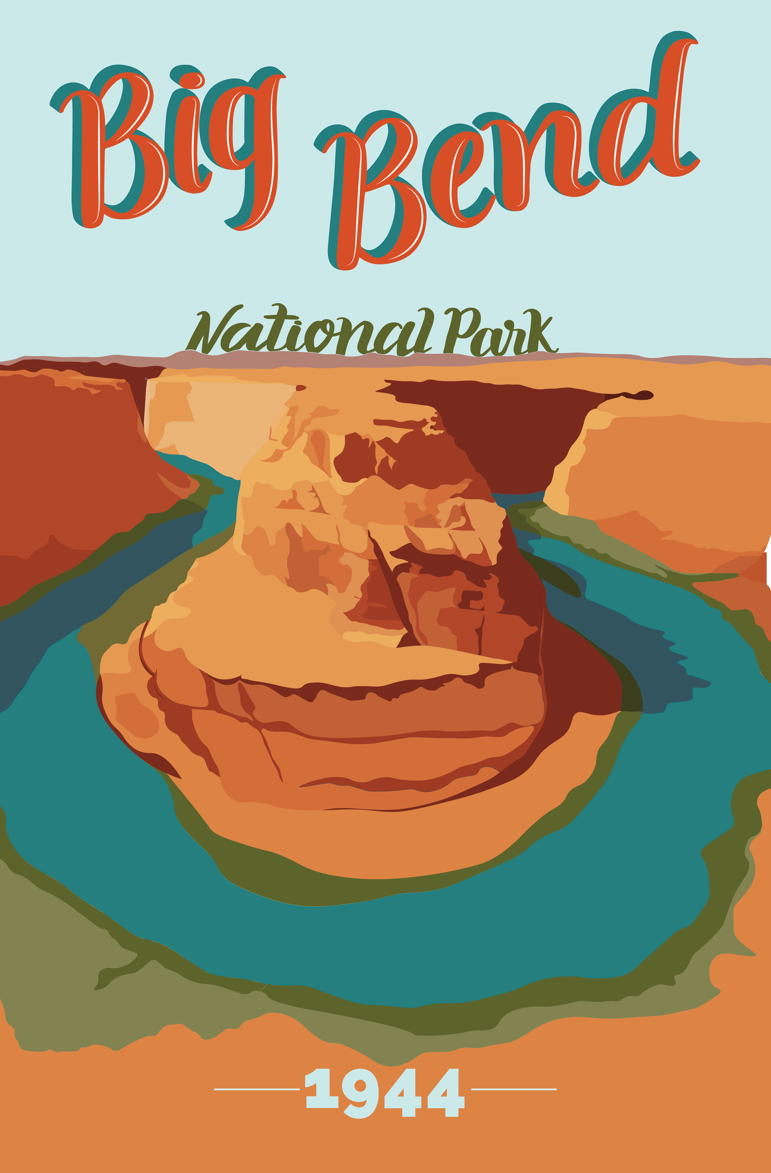
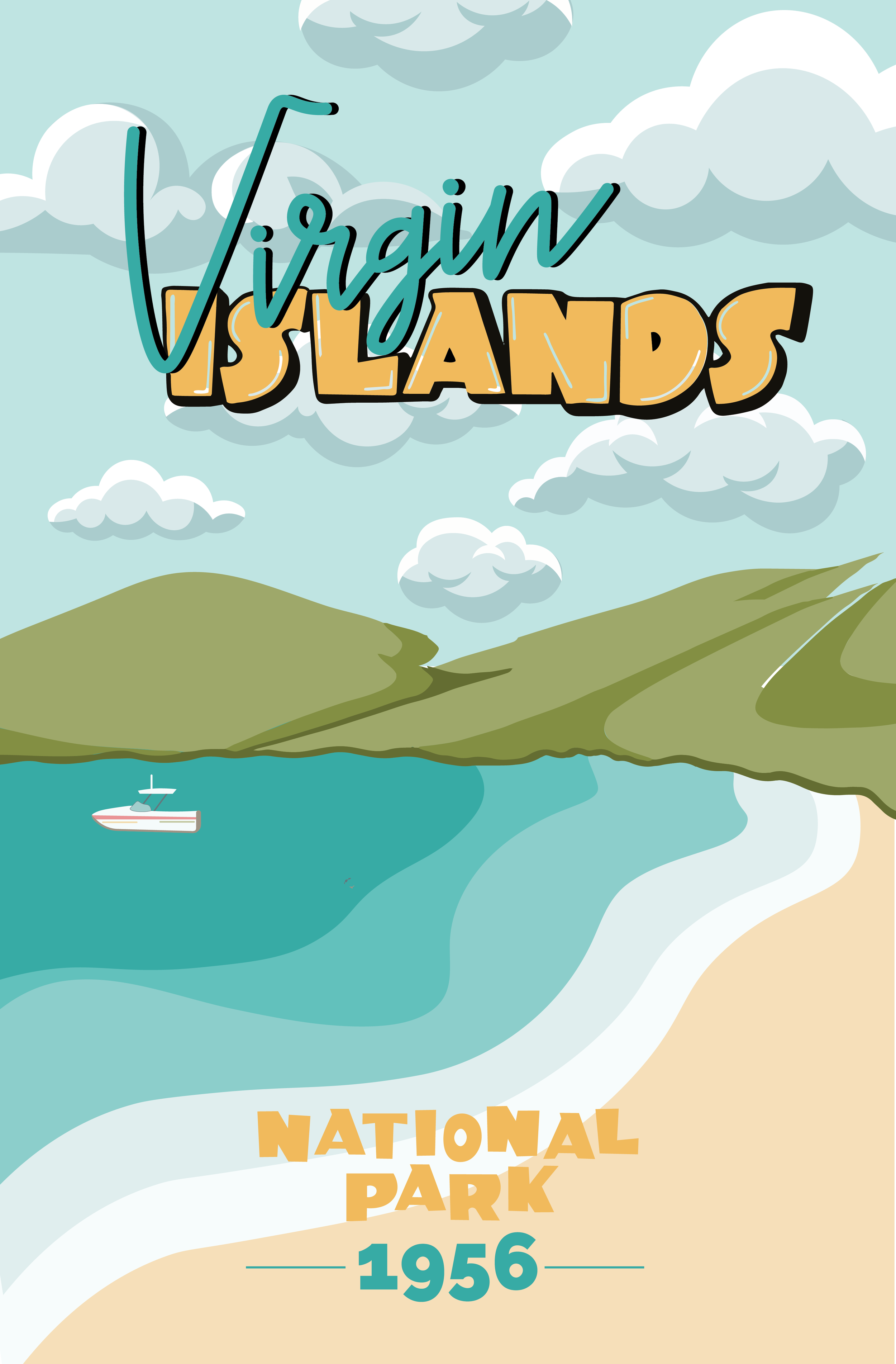
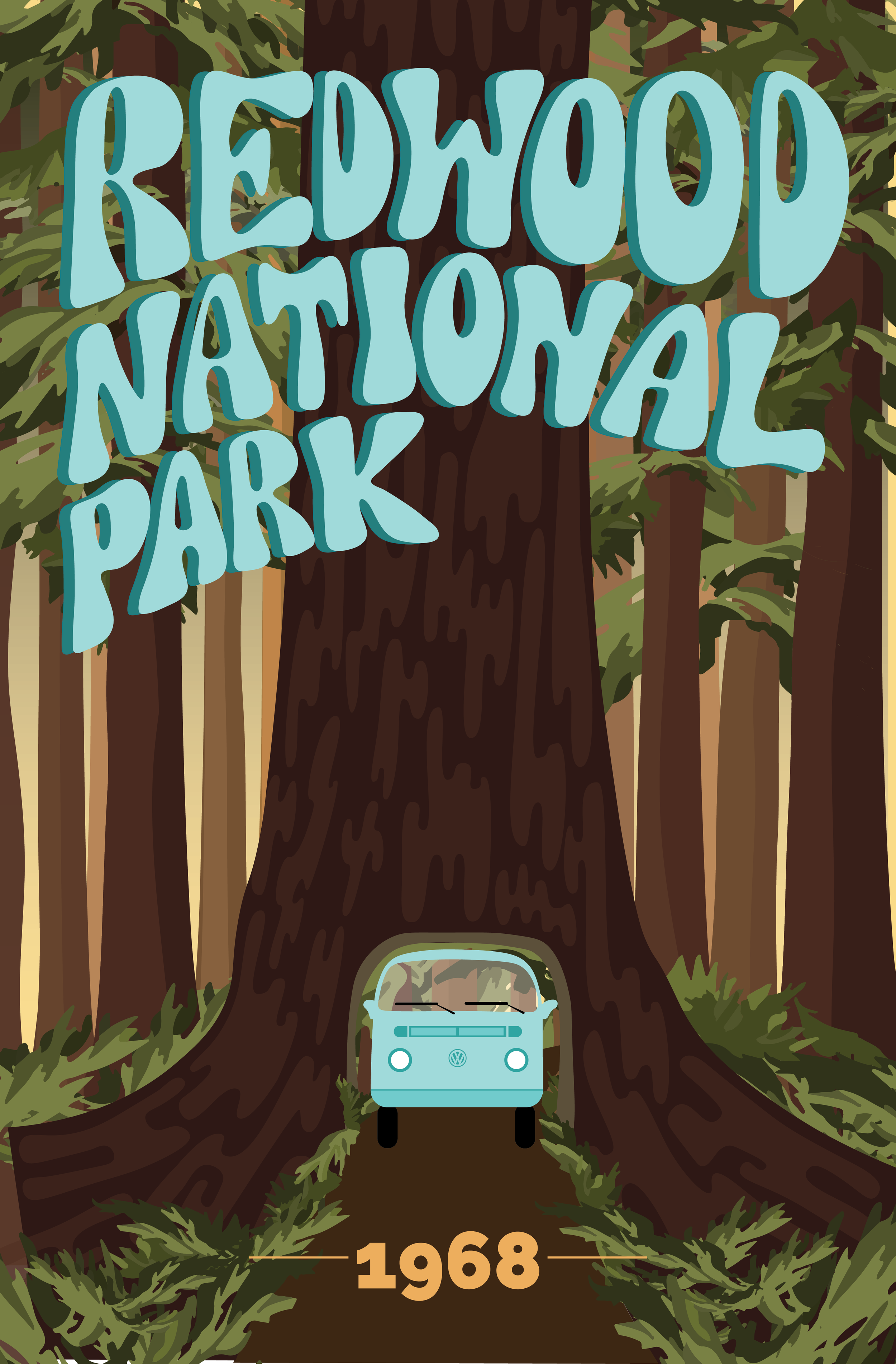
In college, my senior capstone was an in-depth research project exploring the intersection of history, design, and my lifelong passion for the outdoors. I created a series of posters focused on the National Park Service, with the typography/lettering for each piece designed to reflect the decade each park was founded. While each poster features a unique type treatment—mirroring the lettering trends of its era—the collection remains a fully cohesive set held together by a disciplined color palette and a consistent illustrative style. This project highlights my ability to build a "brand world" that is diverse and expressive, yet unmistakably unified. It serves as a powerful reminder that this level of research and hand-crafted detail is often what gives a visual identity its soul, turning a standard project into a community-led story.
The Artist’s Playground
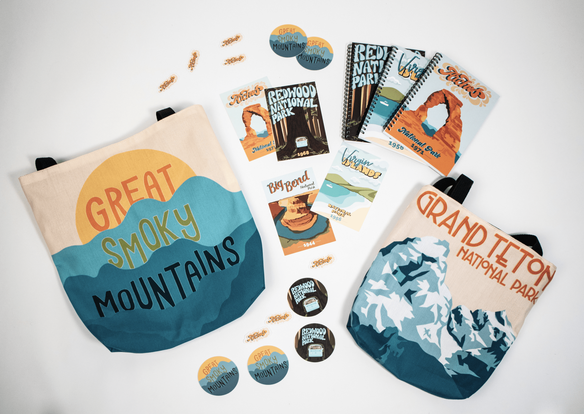
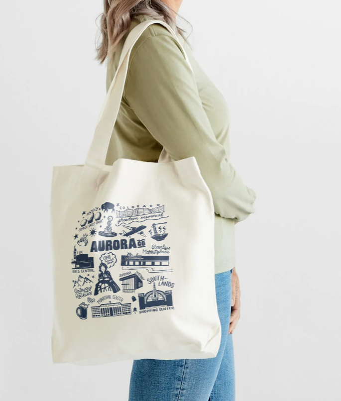
Beyond the systems and the strategy, I believe a brand truly comes to life in the "unscripted" moments. This collection of illustrative work is where I push the boundaries of color theory and bold graphics to find that elusive human touch. Whether it’s a limited-edition tote bag for Visit Aurora or experimental textures that break the digital mold, these pieces show how a little bit of "play" can turn a corporate identity into something people actually want to be a part of. It’s proof that while a brand needs a backbone, it’s the art that gives it a pulse.
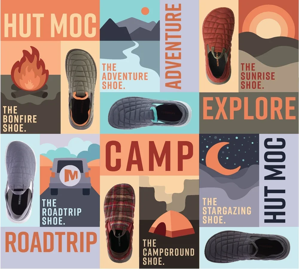
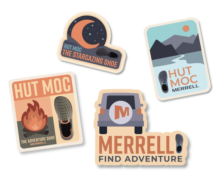
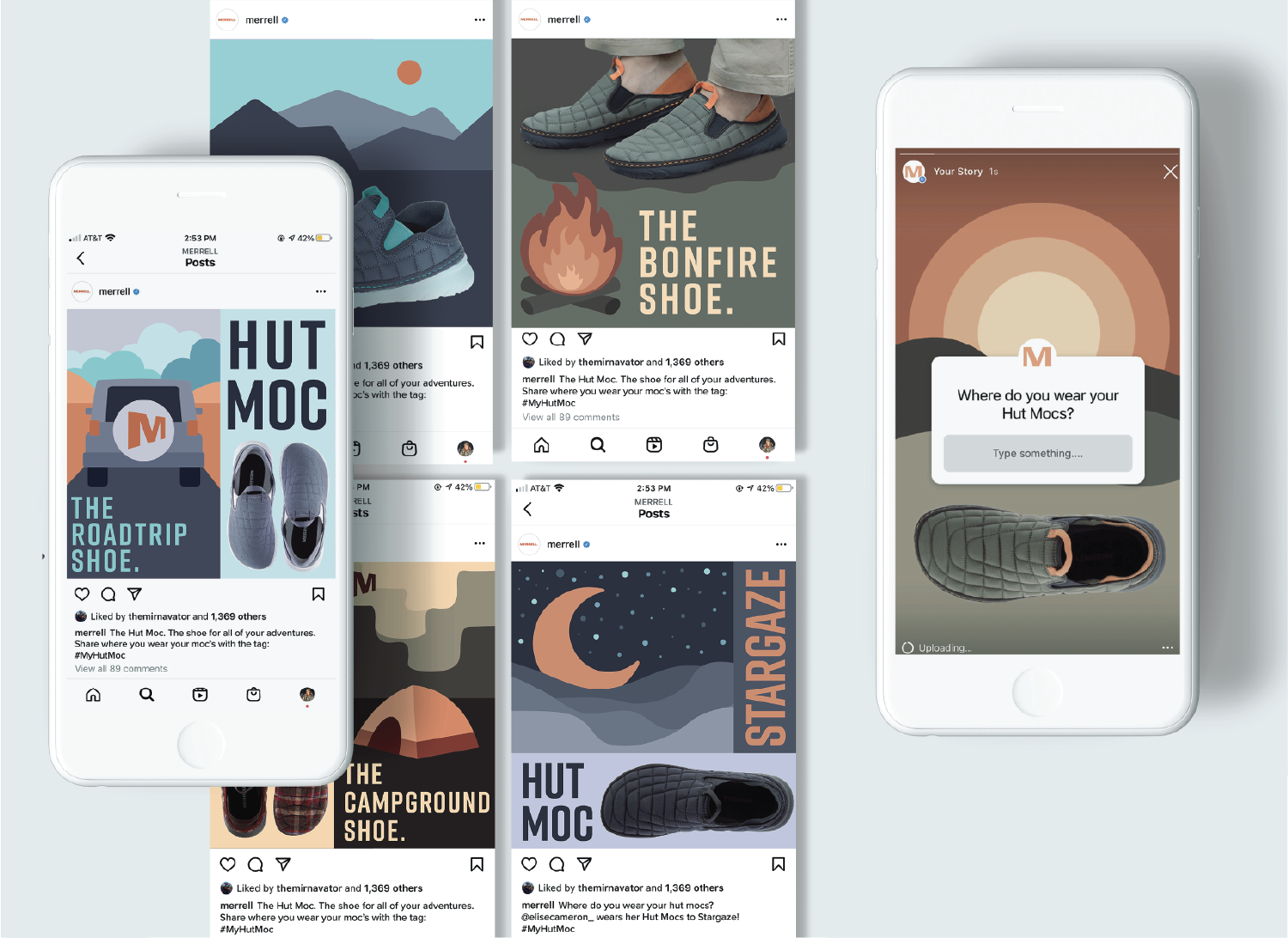
Brand Study for Merrell